Here we look at temperature measurements made at three sites in Auckland over roughly the same period. The raw data show a warming trend at each individual site. When you join the data, you need to take account of climatic differences between measuring sites.
In this example of why you sometimes need to adjust raw data to determine a long-term temperature trend, we use temperatures measured at three sites in Auckland over the period 1950-2000:
- Albert Park (red line)
- Mangere (blue)
- Owairaka (green)
Measurements from Albert Park and Mangere form part of the Auckland composite record used in the NIWA seven-station temperature series. Owairaka is a completely separate record.
Raw data suggest Auckland is warming

This graph shows the annual averages of the monthly mean temperatures taken straight from NIWA’s Climate Database, with no adjustment made to the raw measurements.
The dashed lines are linear trends fitted to the data (by least squares linear regression) over the period shown. All three lines trend slightly upwards, indicating that all three sites got warmer over this period.
Temperature records from other local sites, such as Auckland airport, show warming too.
How adjustments were made to join Albert Park and Mangere
We want to join these two sites so we can find out how Auckland’s temperature has been changing over a longer period of time than is available for each site by itself.
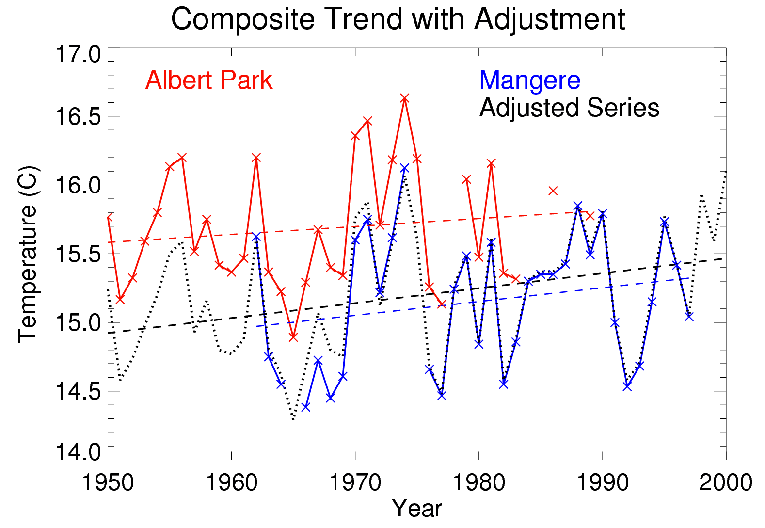
The graph shows Albert Park (red line) and Mangere (blue) experienced very similar patterns of hot and cold years, but Albert Park is warmer than Mangere by about 0.6°C on average.The black dotted line shows the combined Auckland temperature trend. This adjusted series follows Albert Park for 1950-1975, then Mangere for 1976-1997, then Auckland Aero from 1998 onwards.
The Albert Park data have been adjusted downwards by 0.6°C to allow for the different climates of the two sites (i.e., because Albert Park is about 0.6°C warmer) before the Albert Park data are joined to the Mangere data.
Again, the trends for the three series are shown as dashed lines. The slope of the black trend line for the composite (adjusted) series is very similar to the trends calculated separately from the raw data. This is a good check that the composite trend is in fact a real trend.
What happens if you don’t adjust data in this case?

Here we again show the two sites (Albert Park and Mangere), but this time just for the periods used in the adjusted composite record (i.e., 1950–1975 for Albert Park, and 1976–1997 for Mangere). Trends are shown in red and blue as before. Also shown (black dashed) is the ‘trend line’ that would be calculated if the Albert Park and Mangere records were incorrectly joined without adjusting for the site difference.
Temperature measurements are trending upwards as time goes on during the ‘red’ period (at Albert Park). During the ‘blue’ period of measurements (at Mangere), the trend is also upwards (getting warmer). But the black combined ‘trend line’ goes in the opposite direction – it looks like Auckland got colder. That largely reflects the fact that Mangere is an average of 0.6°C cooler than Albert Park. It should not be interpreted as a trend.
What does all this mean?
NIWA’s adjustments, which follow internationally accepted procedures, are done to preserve the underlying trends in the raw data. If an adjustment is not made for discontinuities such as site changes, you might be picking up a ‘false trend’ based on climatic differences between sites.
Adjustments are often necessary in order to estimate meaningful longer record trends. Over the 100 year period from 1909 to 2009, the least squares linear trend for the composite 'Auckland' annual temperature trend is +1.29 ºC, with an associated 95% confidence interval of +0.99 ºC to +1.59 ºC.