Latest data
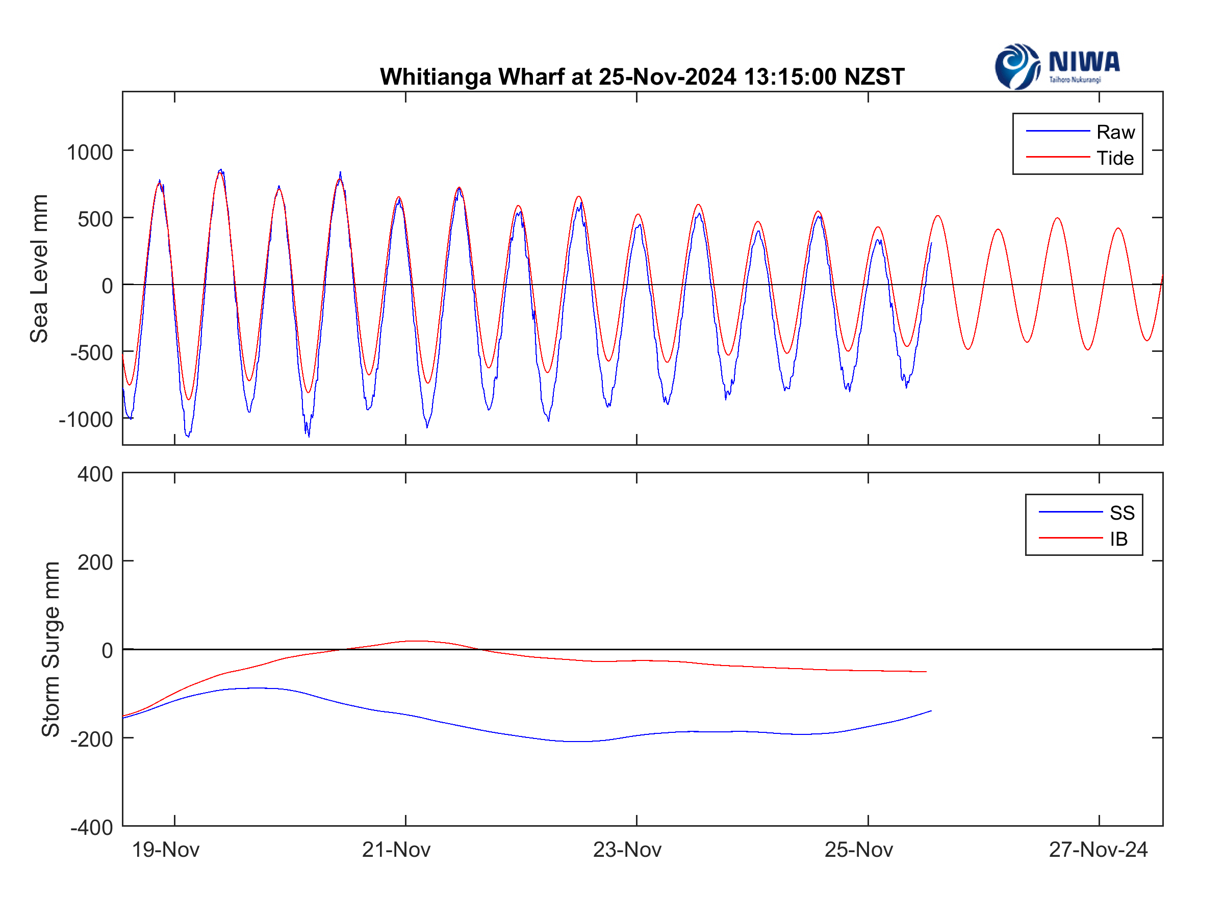
The upper plot compares raw data (blue) and forecast tide (red). When the two curves are aligned there is no storm surge, which is the elevation or depression of sea level as a result of meteorological conditions. But if the raw data lie above or below the forecast tide, it means we have positive or negative storm surge. The lower plot compares storm surge (SS) with inverted barometer (IB), which is derived from atmospheric pressure. When the two curves are aligned it means that the storm surge is being driven by local pressure changes. However, if they have different shape it means that storm surge is being driven by wind or waves propagating into the region from elsewhere.
Data source – Waikato Regional Council